The availability of pipeline flow data makes the U.S. natural gas market uniquely positioned to grasp with reasonable accuracy where it stands with regional or national supply and demand on a daily basis. If you understand how to wrangle and finesse this robust data source, you can make a pretty good estimate of where the supply is, where it is headed, how it’s being consumed, and ultimately, what that all means for prices. Today we wrap up our series on natural gas production estimates and how the industry uses pipeline flow data to track gas production trends in real time.
Recap
In Part 1 of this series, we compared the pros and cons of the U.S. gas production data from the Energy Information Administration (EIA): the Natural Gas Monthly (NGM), and two forward-looking reports, the Short-Term Energy Outlook (STEO) and the Drilling Productivity Report (DPR). In Part 2 we showed how daily pipeline flow data helps fill in the lag in EIA final estimates. We won’t know final EIA estimates for the current month (October 2015) until January, for example, but in the meantime pipeline flow data provides an objective view through the current day. So while the latest (October) DPR is projecting declines in Appalachian gas production (Marcellus and Utica combined) after July 2015, for instance, daily, flow data from our friends at Genscape indicates that production from the region continuing at or near record volumes. In Part 3, we provided a brief primer on flow data that derives from FERC mandated gas shipper website postings of scheduled gas volumes entering or leaving thousands of interstate pipeline meter points. Querying meter flow volumes by geography and other attributes, and aggregating them up to regional levels can provide a good estimate of market supply or demand on any given day. We showed an example of flow data aggregation for Appalachia production.
We start back today with that same example aggregating production data for the states and counties the DPR use to define the Appalachian region. For easy reference, we reproduce the map from Part 3 again in Figure 1 that shows how meters have physical locations (represented by the black dots) and flow data captures volumes that are scheduled at these points along pipelines. Today we’ll show how the data can be used to follow Appalachia production trends, using Genscape’s real-time natural gas database.
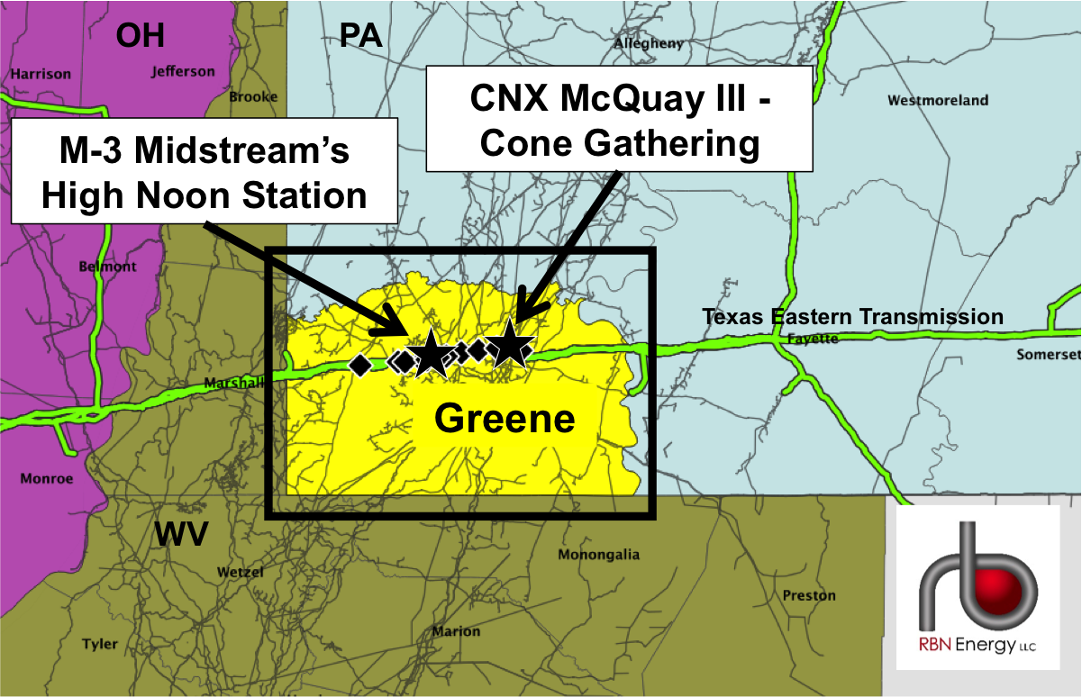
Figure 1; Source: RBN Energy
Figure 2 below illustrates how the data aggregation builds up from the individual meters in Figure 1 to regional production flows within Appalachia. Follow the graphic from left to right to zoom out from meter level granularity on one pipeline (Spectra’s Texas Eastern Transmission Co, or TETCO in Greene County) on the left (graph #1) to the county level (graph #2), the state level (graph #3) and finally the region level (graph #4). To get the total for all of Appalachia by region requires aggregation of the detailed readings.
About the song
“Sooner or Later” was sung by Madonna, and written by Stephen Sondheim, for the 1990 film, Dick Tracy. Released that same year on Madonna's album I'm Breathless, the song won Sondheim an Academy Award for Best Original Song in 1991.