One goal of the RBN blogosphere is to provide clarity to a highly intricate, interwoven energy complex. Today we are going to tackle an aspect of energy markets that has vexed us for some time. We’re going to explore some of the big numbers that are used to measure energy markets, what they mean to the oil patch (Cowtown, a.k.a., Fort Worth here in Texas is a good example of that) and to each of us as energy users. So put on your thinking cap and tell your colleagues to leave you alone for five minutes. We’re going to expand our minds.
The Unfathomable Quad
A recent Pew Research article stated: Last year the U.S. generated a record 79.1 quadrillion BTU domestically, nearly 14% more energy than in 2005. The statement is factually correct, but many of us (author included) have a very difficult time envisioning what 79.1 quadrillion BTU look like. A quadrillion of anything is quite a lot. More precisely, one quadrillion is written numerically as:
1,000,000,000,000,000 (one, followed by 15 zeros)
People who work with energy statistics will often see numbers like this. The EIA and IEA web sites are peppered with such numbers. To understand our national energy infrastructure we need to be able to place such numbers into context. But how does one do that?
There are numerous ways to measure energy, but within the United States the BTU is the most common. (BTW, the British don’t use the BTU. They, like most of the rest of the world are on the metric system.) A BTU is defined to be the amount of heat needed to raise one pound (one pint) of water at maximum density through one degree Fahrenheit. Assuming that your dinner recipes have not recently asked you to heat one pound of water at maximum density one degree, a few more familiar examples of a BTU might be helpful.Let’s begin the answer with an explanation of a basic measure of energy: the British Thermal Unit, or BTU. Once we understand the BTU, we’ll better understand why people in the energy market are forced to deal with some incredibly large numbers.
A BTU is roughly equivalent to the energy produced by burning one wooden match. Source: Union of Concerned Scientists. Further, a BTU is capable of heating approximately 57 cubic feet of air by one degree [1]. A BTU is thus a very small amount of energy. And it’s precisely because a BTU is such a small amount of energy that descriptions of national energy production or consumption with BTUs involve very large numbers.
Let’s try to work our way up from a few wooden matches (BTUs) to typical household energy consumption in BTUs, and then to state and national consumption. A typical Massachusetts home consumes an average of 300,000 BTU per day (0.3 MMBtu/d). That’s 109 million BTU each year, or 109 MMBtu / year. Source: EIA. On the other side of the country, a typical California home consumes 62 MMBtu per year. Source: EIA. Want to compare these numbers to an estimate for your own home? You can check out an online calculator such as the one at Apogee. Certainly the difference between a home in Massachusetts and one in California is a lot wider this year.
Scaling these numbers to a state level is easy: just multiply by the number of homes in a state. According to the US Census, Massachusetts has 2.8 million housing units. That implies that MA homes consume a total of approximately 840,000 MMBtu/d of energy. Already the numbers are getting too big to comprehend. And it just gets worse: in a year’s time, those MA homes consume 0.3 quadrillion BTUs of energy. Here we are, back to that quadrillion word, which is sometimes abbreviated as a quad.
National Energy Consumption
It gets worse before it gets better, but stay with us. When we start scaling the BTUs to nationwide energy production and consumption the numbers are truly mind boggling. Nationwide, for example, annual residential energy consumption totals roughly 6,000 trillion BTUs (TBtu), or six quadrillion BTUs. That is simply a huge number.
We’ve discussed only residential energy consumption thus far. That’s the tiny light blue slice on Figure #1 below. As noted in the Figure, the EIA monitors several other sectors of energy consumption, and tracks them on both a monthly and an annual basis. Figure #1 presents the total annual US fuel consumption by sector, in units of quadrillion BTU. This EIA data begins in year 1973; we’ll summarize across select years.
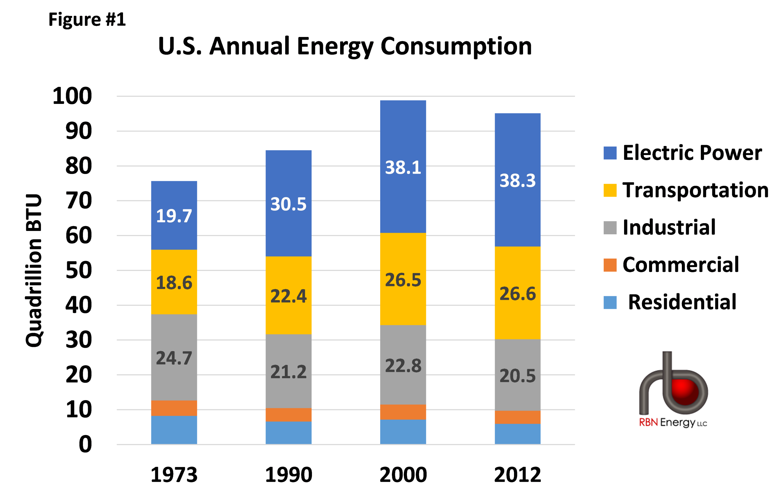
Figure #1: Annual Energy Consumption Source: EIA September 2013 Monthly Energy Review
Figure #1 also illustrates some important trends in the US appetite for energy. First, the residential and commercial sectors have seen declines in annual consumption since the 1970’s owing to increases in heating, cooling and appliance efficiency. Industrial consumption has been relatively flat for decades. In contrast, consumption in the transportation and power generation sectors is up significantly across the decades. We’re driving more cars to our electronics-stuffed homes and offices.
However, Figure #1 does not answer the question we’re all asking at this point: what are these quadrillion BTUs? To answer this, we’ll match big numbers with big words. First, let’s agree that Figure 1 is obfuscatory. The table presents accurate numbers, but the meaning of the numbers is evasive or confusing. Can we improve this graphic? Yes, we can. To do so, we’ll employ another big word: normalization.
Normalizing a number means simply to divide it by another number. Let’s think about the numbers in Figure #1 and why they are so large. First, the numbers describe BTUs, which are incredibly small. Second, the numbers describe annual consumption for the United States. We can make these numbers smaller, and thus more comprehensible, by converting to MMBtu (millions of BTUs), and by converting from annual to daily, and from national to individual. The effect of all these changes is to make the table’s numbers smaller.
Let’s begin the process by converting the numbers from national to individual (per-capita). This will show that Figure #1 is actually a bit deceptive: since 1973 the US population has steadily increased, and more people equates to more energy consumed. If we convert the numbers in Figure #1 to per-capita (using a population of 212 million in 1973, and 315 million in 2012) we find a much different consumption profile, as per Figure #2 below.
About the song
Big Balls in Cowtown is a song by Bob Wills and His Texas Playboys, released in the 1940s and written by Hoyle Nix. If you were wondering, the song is about the big dance coming up in Cowtown – The big ball’s (ball is) in Cowtown.


Comments
Finally someone with a more refined taste in music. I bet it was tempting to use the "Sankey Pew" joke. Seriously, a very well written article. It really is hard to get your arms around some of the data magnitude. Keep them coming.
It would be really interesting to re-cast the 2012 Sankey diagram for future years based on projections of shale production. Considering best available current information, when do petroleum imports fall off the diagram? Of course, we'd also have to make assumptions concerning consumption. For instance, how do you factor in increases in industrial consumption based on re-shoring and expansion?
Good topic for a future RBN posting!
Enjoyed the first comment by Marktristream regarding musical tast, but didn't understand the "Sankey Pew" reference and got no help from a websearch.
Maybe you will consider tackling another vexing number problem. The industry continues to report on a "boe" basis, converting gas at a 6/1 ratio, yet as we all know it is more like 20+/1 on a price basis. So comparing companies on a boe basis more often than not makes for poor comparability. Perhaps a new revenue standard needs to be developed, using some agreed-upon market price, so that a 1,000 boe well which is 90% gas doesn't seem to the uninitiated as valuable as a 1,000 boe well that is all crude.