Last year natural gas power burn increased by 6 Bcf/d over 2011. This year power burn levels in the first quarter were down 10 percent from 2012. Peabody Energy reported last week that coal consumption for generation is growing this year versus 2012. Today we ask whether 2012 power burn was an anomaly and what we should expect in 2013.
NYMEX Natural gas futures prices closed yesterday at $4.167/MMBtu (April 25, 2013) - still above $4/MMBtu despite signs that winter demand is finally giving way to warmer weather. Many market analysts believe that support for continued high natural gas prices through the summer of 2013 depends on power burn to soak up record levels of production. If that demand does not materialize then excess gas supplies will build up in storage and weigh on prices. But do they mean power burn like we saw in 2012? We looked at historical power generation data to find out if we can reasonably expect to see a repeat of last year’s power burn levels in 2013 and if not – then what level of power burn should we expect?
We retrieved the data for our analysis using the new Energy Information Administration (EIA) electricity browser. This application on the EIA website allows you to browse through power generation statistics and select data, report types and charts interactively. Free analysis for your tax dollars! Gotta love that.
We looked first at US data since the start of 2009 to compare electricity generated using coal and natural gas. Chart #1 below shows monthly US coal (red line) and natural gas (blue line) generation measured in thousand gigawatt hours (MGWh - one GWh would supply about 1 million US homes for an hour). You can see that for most of the period (the latest data is for February 2013), coal generation levels were well above natural gas. From January 2009 to December 2011 coal generation was 1.9 times higher than natural gas on average. Then all of a sudden in 2012 coal generation took a nose dive to levels not seen previously or since (green circle on the chart). By April 2012 coal and natural gas generation were neck and neck at about 96 MGWh each. That dramatic fall off in coal generation corresponded to natural gas prices sinking to a ten year low under $2/MMBtu in April 2012. The chart also shows that during the summer of 2012 the peak of coal generation was sharply lower than in previous years while the peak of gas generation was significantly higher. These dramatic gyrations in the data indicate to us that 2012 was an anomaly – outside the normal range of data – caused by unusually low natural gas prices, that is unlikely to be repeated anytime soon.
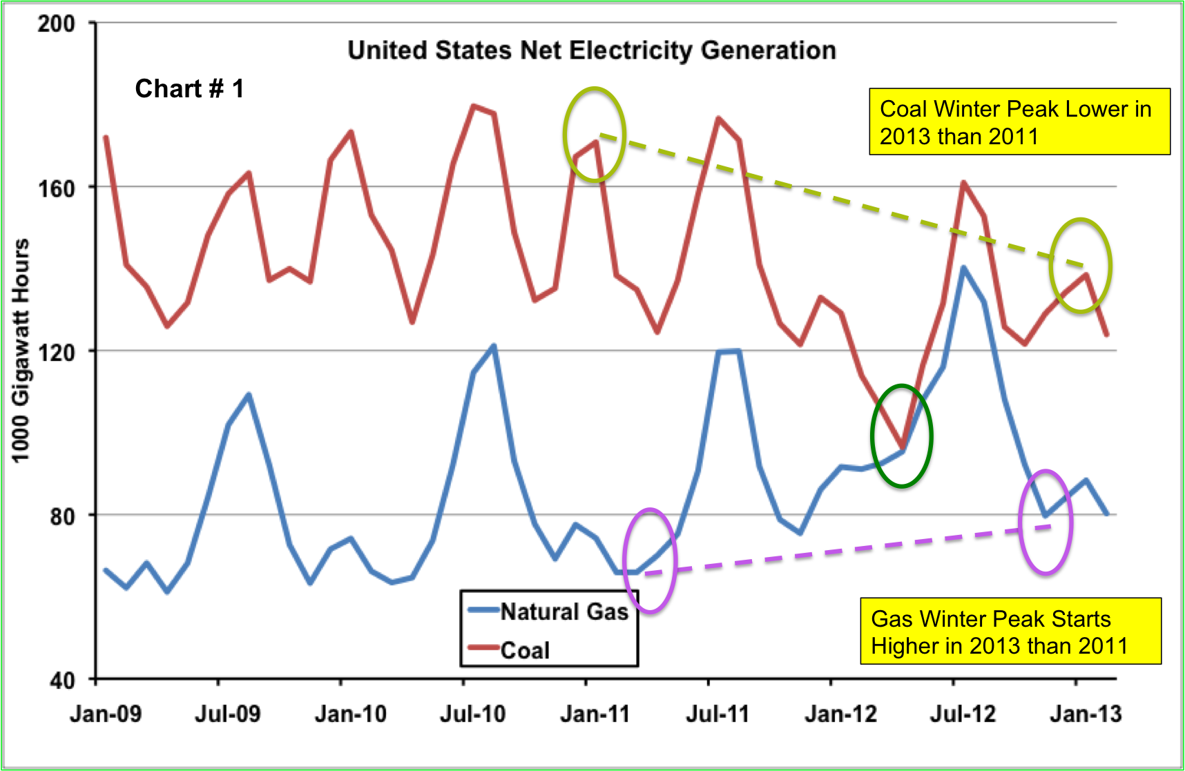
Source: EIA
During the period before 2012 the coal and gas data exhibit a strong seasonal pattern. Coal generation peaks in the summer and peaks again slightly lower in the winter. Gas generation peaks in the summer and shows a smaller winter peak during January. If we ignore 2012 and compare the winter peaks for coal and gas in 2011 to what we have seen so far this year the data shows a strong trend to higher natural gas generation. The natural gas winter peak in 2013 started at higher levels than the winter peak for 2011 (purple circles on the chart). The winter peak for coal generation in 2013 is markedly lower than it was in 2011 (light green circles on the chart).
Next we looked at the difference in generation data between the two major operators of power generation in the US market – electric utilities and independent power producers (IPPs) to see if they responded differently before and after the 2012 “anomaly year”. Electric utilities are publicly owned entities that provide electric power to end use customers in geographic service territories. IPPs are privately owned generation companies that sell power to utilities or other users such as heavy industry through arms-length contracts. Electric utilities generate roughly two thirds of US power and IPPs generate one third. Chart # 2 below shows coal and gas power generation by electric utilities since 2009. Utilities generate on average three times as much power using coal as gas. That is because utility generating assets were mostly built during an era when generating power from coal was much cheaper than natural gas. And ratepayers could better absorb the relatively high cost of coal plant investment. [Note that for this analysis we are only comparing coal and natural gas generation and not considering nuclear, hydro, renewables or other power sources.] The chart shows that utilities followed the national trend and responded to the dramatic 2012 dip in natural gas prices by major switching from coal to natural gas powered generation (green circles).
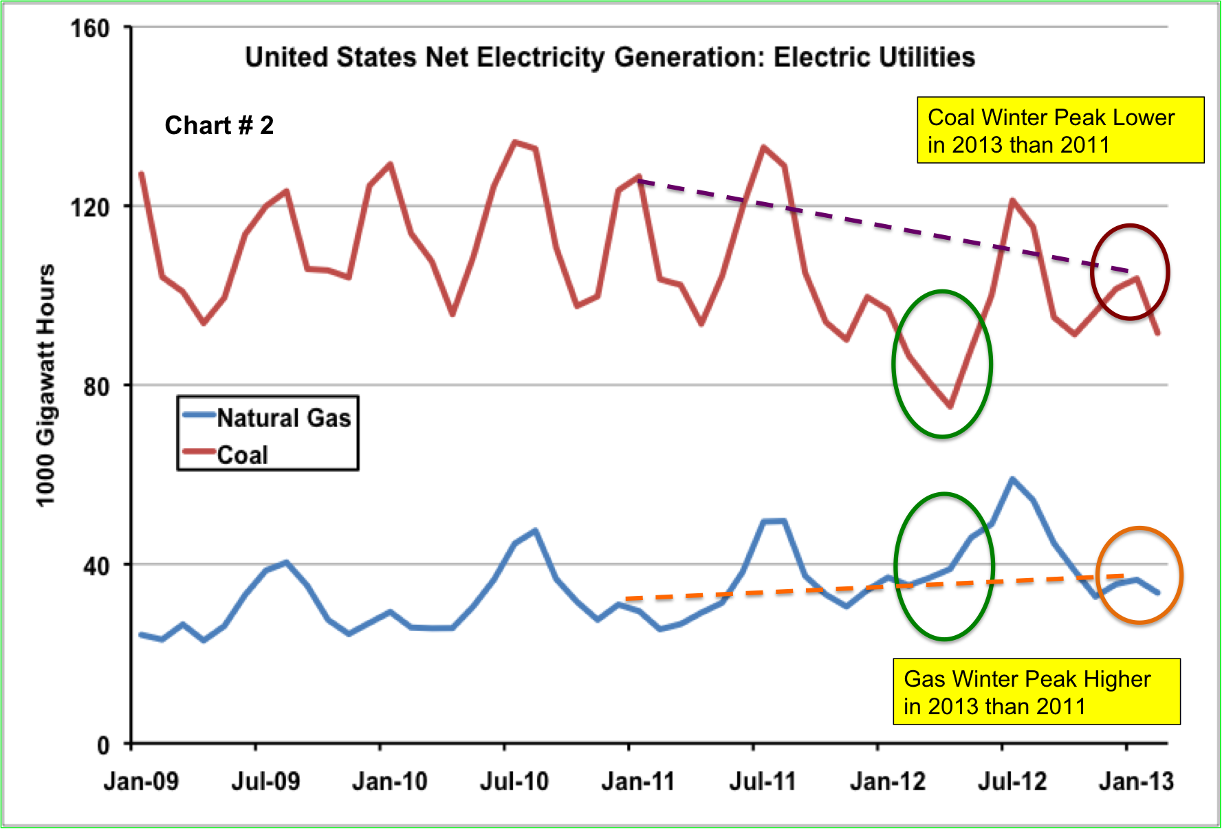
Source: EIA
Electric utilities tend to run their generating assets throughout the year at high rates and to buy extra power from IPPs during periods of peak demand. If we ignore the 2012 “anomaly year” the coal generation data in Chart #2 shows a strong seasonal shape during 2009 to 2011 with both winter and summer peaks. Natural gas has a higher peak during the summer and a smaller winter peak. So far this year (2013) the winter peak for natural gas is a little higher than it was in 2011 (orange dotted line and circle) and the 2013 winter peak for coal is sharply lower than it was in 2011(magenta dotted line and circle). Electric utilities therefore followed the same trend that we saw for overall US generation with natural gas trending up against coal but no sign of a return to the unusual power burn levels seen in 2012.
While electric utilities run their generating assets throughout the year, IPPs typically generate more power during the summer. Chart #3 below shows coal and gas power generation by IPPs since 2009. Where electric utilities favor coal generation, IPPs favor natural gas generation so the gas numbers are higher. That is because many IPPs invested in relatively inexpensive natural gas fired “peaking” plants that are designed to sell power during summer peak demand periods when power prices are at their highest (see Talkin ‘Bout My Generation). Once again ignoring the 2012 data you can see the same higher trend for winter 2013 gas generation versus 2011 (red circle and dotted line) and lower trend for winter 2013 coal generation versus 2013 (green circle and dotted line) as we saw for electric utilities. We will have to wait for the larger summer peak data in 2013 to get a clearer picture of how much gas IPPs will burn this year.